7R – Explain what are marginal, joint and conditional distributions and how we can show the Bayes theorem for relative frequencies.
Joint probability
Joint probability is the probability of two events happening together. The two events are usually designated event A and event B. In probability terminology, it can be written as P(A ∩ B)
A joint probability distribution shows a probability distribution for two (or more) random variables. The formal definition is: f(x,y) = P(X = x, Y = y).
The whole point of the joint distribution is to look for a relationship between two variables. For example, the following table shows some probabilities for X and Y happening at the same time:

Marginal distribution
If X and Y are discrete random variables and f (x,y) is the value of their joint probability distribution at (x,y), the functions given by:
g(x) = Σy f (x,y) and h(y) = Σx f (x,y) are the marginal distributions of X and Y , respectively.
A marginal distribution gets it’s name because it appears in the margins of a probability distribution table. If you look at the probability table above, the sum probabilities of one variable are listed in the bottom row and the other sum probabilities are listed in the right column. So this table has two marginal distributions(py(j) and px(i)).
The conditional probability of X given Y is the probability distribution of X when Y is a particular value written as Pr[ X | Y=y ].
A conditional distribution is a probability distribution for a sub-population. It shows the probability that a randomly selected item in a sub-population has a characteristic you’re interested in.

Bayes
The Bayes formula can be derived from the general formula of conditional probability. Calculate the conditional probability that an event X will occur given that the event Y has already occurred. P(X,Y) is the joint probability that happens booth the X and Y events, divided the marginal frequency of Y.

This is the theorem:

This formula can be calculated using the conditional distribution table. E.g. looking the table we want calculate the
P(X=1, Y=5) = P(X=1) P(Y=5|X=1)/P(Y=5) = 1/6*[(1/36)/(1/6)]/1/6.
8R – Explain the concept of statistical independence and why, in case of independence, the relative joint frequencies are equal to the products of the corresponding marginal frequencies.
Two events are independent, or stochastically independent if the occurrence of one does not affect the probability of occurrence of the other. In other words two events are independent if:

This formula shows also the bound between independence and conditional probability.
If we consider a distribution of event is evident that the join probability of two independent events is equal to the marginal distribution.
9R – Do a research about the most common charts useful for statistics.
One goal of statistics is to present data in a meaningful way. Often, data sets involve millions of values and this is the reason why the graph often are essential to understand the meaning of data: graphs convey information quickly and easily to the user.
Different situations call for different types of graphs, and it helps to have a good knowledge of what types are available. The type of data often determines what graph is appropriate to use.
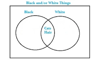
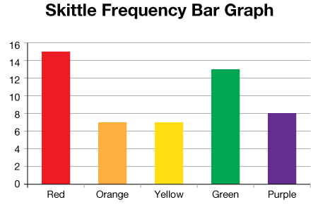
- Bar Graph: bar graph is a way to visually represent qualitative data. Data is displayed either horizontally or vertically and allows viewers to compare items, such as amounts, characteristics, times, and frequency.
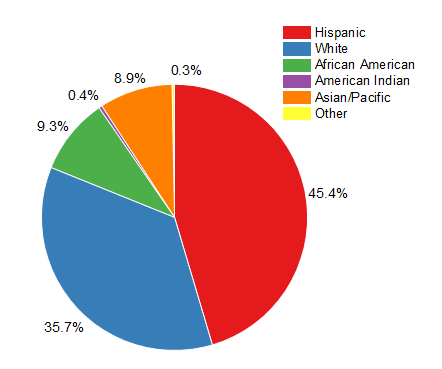
- Pie Chart: It gets its name from the way it looks, just like a circular pie that has been cut into several slices. This kind of graph is helpful when graphing qualitative data, where the information describes a trait or attribute and is not numerical. Each slice of pie represents a different category, and each trait corresponds to a different slice of the pie.
- Histogram: This type of graph is used with quantitative data. Ranges of values, called classes, are listed at the bottom, and the classes with greater frequencies have taller bars. A histogram often looks similar to a bar graph, but they are different because of the level of measurement of the data. Bar graphs measure the frequency of categorical data. A categorical variable is one that has two or more categories, such as gender or hair color.
:max_bytes(150000):strip_icc()/Travel_time_histogram_total_1_Stata-5a788217d8fdd500372f00fd.png)
- Scatterplots: A scatterplot displays data that is paired by using a horizontal axis, and a vertical axis. The statistical tools of correlation and regression are then used to show trends on the scatterplot. A scatterplot usually looks like a line or curve moving up or down from left to right along the graph with points “scattered” along the line. Are useful to understand Any outliers from the overall trend and the shape of any trend.

- Time-Series Graphs: A time-series graph displays data at different points in time, so it is another kind of graph to be used for certain kinds of paired data. As the name implies, this type of graph measures trends over time, but the timeframe can be minutes, hours, days, months, years, decades, or centuries.

7_A. Create – in your preferred language C# or VB.NET – a program which is able to read ANY file CSV (or at least 99% of them), assuming no prior knowledge about its structure (do not even assume to that a first line with variable names is necessarily present in the CSV: when not present, clearly, do some useful automatic naming). The program should use your intelligence, creativity and data checking functions to achieve this task. The GUI should display the variables in a control, such as for instance a Treeview and let the user select the data type for each field in the CSV files. Also, some data preprocessing should be carried out on the data (or a suitable subset) in order to empirically establish the most suitable type of data of each field and, thus, give a preliminary tentative choice of data types for the variable fields to the program user (which he can, then, try to change on the GUI at his will before attempting to read the file).
https://drive.google.com/file/d/1VD-Wj4sewOWgZG-9dh_bCYp_PdOiBKel/view?usp=sharing
4RA – Find on the internet and document all possible ways you can infer a suitable data type, useful for statistical processing, when you are getting data points as a flow of alphanumeric strings.
private Type parseString(string str)
        {
            Boolean boolValue;
            Int32 intValue;
            Int64 bigintValue;
            Double doubleValue;
            DateTime dateValue;


            if (Boolean.TryParse(str, out boolValue))
                return typeof(Boolean);
            else if (Double.TryParse(str, out doubleValue))
                return typeof(Double);
            else if (Int32.TryParse(str, out intValue))
                return typeof(Int32);
            else if (Int64.TryParse(str, out bigintValue))
                return typeof(Int64);
            else if (DateTime.TryParse(str, out dateValue))
                return typeof(DateTime);
            else return typeof(String);

        }
5RA – Do a research about Reflection and the type Type and make all examples that you deem to be useful.
Reflection provides objects that describe assemblies, modules, and types. You can use reflection to dynamically instantiate a type, bind the type to an existing object, or get the type from an existing object and invoke its methods or access its fields and properties. If you use attributes in your code, reflection allows you to access them.
Type is at the base of reflection, a characteristic of many objects oriented languages that let the code adjust its attributes based on the type of an object.
namespace WindowsFormsApp1
{
    class Studente
    {
        public int age;
        public double height;
        public string name;

        public Studente(int age, double height, string name)
        {
            this.age = age;
            this.height = height;
            this.name = name;
        }

        public Studente() { }

        public static void main (String[]args)
        {
        	Studente s1 = new Studente(18, 176.8, "Tom");
        	Type t1 = s1.GetType();
        	Type t2 = typeOf(Studente);
        }
    }
}
6RA – Do a comprehensive research about the GRAPHICS (GDI+ library) object and all its members.
The Graphics Device Interface (GDI) is a Microsoft Windows application programming interface and core operating system component responsible for representing graphical objects.
GDI is responsible for tasks such as drawing lines and curves, rendering fonts and handling palettes.
GDI’s most significant advantages over more direct methods of accessing the hardware are perhaps its scaling capabilities and its abstract representation of target devices. Using GDI, it is very easy to draw on multiple devices, such as a screen and a printer, and expect proper reproduction in each case.
The services of Windows GDI+ fall into the following three broad categories:
- 2-D vector graphics. Vector graphics involves drawing primitives (such as lines, curves, and figures) that are specified by sets of points on a coordinate system. For example, a straight line can be specified by its two endpoints, and a rectangle can be specified by a point giving the location of its upper-left corner.
GDI+ provides classes that store information about the primitives themselves, classes that store information about how the primitives are to be drawn, and classes that actually do the drawing. For example, the Rect class stores the location and size of a rectangle; the Pen class stores information about line color, line width, and line style; and the Graphics class has methods for drawing lines, rectangles, paths, and other figures. There are also several Brush classes that store information about how closed figures and paths are to be filled with colors or patterns. - Imaging. Certain kinds of pictures are difficult or impossible to display with the techniques of vector graphics. For example, the pictures on toolbar buttons and the pictures that appear as icons would be difficult to specify as collections of lines and curves. A high-resolution digital photograph would be even more difficult to create with vector techniques. Images of this type are stored as bitmaps, arrays of numbers that represent the colors of individual dots on the screen.
- Typography. Typography is concerned with the display of text in a variety of fonts, sizes, and styles. GDI+ provides an impressive amount of support for this complex task.
Bibliography
https://www.statisticshowto.com/joint-probability-distribution/
https://www.statisticshowto.com/marginal-distribution/
https://betterexplained.com/articles/understanding-bayes-theorem-with-ratios/
https://www.thoughtco.com/frequently-used-statistics-graphs-4158380
https://docs.microsoft.com/it-it/dotnet/csharp/programming-guide/concepts/reflection
https://docs.microsoft.com/en-us/windows/win32/gdiplus/-gdiplus-the-three-parts-of-gdi–about
https://en.wikipedia.org/wiki/Independence_(probability_theory)
